


Aspirants have a time of 2 hours and 45 minutes to finish all sections of the IELTS examination. Writing, reading and listening abilities are examined together, however, whether the quiz is computer-based or paper-based. The IELTS examination can be given online through the IELTS indicator test. You must discover creative techniques to enable you to speed up your task when attaining the IELTS quiz.
Smart policies will also help you enhance your precision. So, when you start your activity, observe the techniques to be utilized and use them in your training trial. The candidate is provided 60 minutes for the writing section, during which period he must obtain two assignments.
Each assignment has topics where the candidate needs to describe, put down his opinions, and examine the text. The competitor should fulfil well versed with the clever tricks to obtain the assignment in the stipulated period.
Pie Chart for IELTS Writing Task 1
In Academic assignment 1 of the writing section, you are required to compose a short descriptive summary based on visual data or information. This visual data may be illustrated as graphs, tables, maps or pie charts.
Pie charts are circular diagrams divided into ‘pie slices’ or sectors, usually demonstrating percentages. The quantity of each pie slice indicates the relative amount of the information it signifies. Together, the regions build an entire circle. They are generally used in the mass media, the business world and are slightly common in technical or scientific editions.
Pie Chart Samples with Model Answers for IELTS Writing Task
The aspirant is required to convert the data provided in the pie chart into a short descriptive report of about 150 words. The pie chart demonstrates certain data in the form of percentages.
Below given are a few sample pie charts with model answers for the pupils to get a notion of how to transform the visual representation into a short meaningful report. Read the article till the end to get a clear idea about the pie charts of the IELTS writing task 1.
Also Read: IELTS Writing Task 1 Academic Topics 2021: A Complete Guide to Writing Preparation
Pie Chart Sample 1
IELTS Writing Task 1 Pie Chart Model Answer
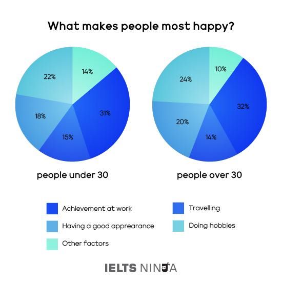
What makes people happy the most?
Numerous factors make people happy. Although every generation has different aspects of making them the happiest. Children, teenagers and old age people all have distinct sources of happiness in life. Let us discuss the similarities and differences between the facets of making people happy under the age of 30 and above it.
The above pie chart illustrates the resemblances and contrasts of the facets of making people happy of young and old generations. First, let’s focus on the resemblances. The greatest percentage of fact bringing people happiness of both generations is an achievement at work, 32% for people over 30 and 31% for people under 30. The next highest percentage indicates hobbies. Hobbies are a good source of making people delighted, especially the old people. They contribute 24% for the older generation and 22% for the younger generation in bringing happiness.
Coming to the differences, the next largest proportion of making old people glad is financial security which participates 20%. While for younger people having a good experience participates 18% in making them happy. 14% of old people’s happiness is being with their family. While 15% of younger people’s happiness is travelling.

Pie Chart Sample 2

Model Answer for Pie Chart Task 1 IELTS
Online sales for retail sectors in Canada.
The two pie charts depict the differences in the amounts of online sales across various retail areas in Canada in the years 2005 and 2010. As we can observe that 35% of online retail of electronics and appliances in 2005 has been deducted to 30% by 2010. While the sales of food and beverages being 22% in 2005, has been increased to 32% by 2010, during the 5 years. It made the highest proportion of the online retail sector in 2010.
The next highest percentage in 2005, is 25% of the sales of home furnishings enterprises which vastly decreased to 15% by 2010. The online video games sales were 18% in 2005, shockingly increased to 23% by 2010.
Also Read: How IELTS Ninja Helps You to Get 8+ Bands? Try the IELTS Indicator Test Now on IELTS Ninja
IELTS Writing Task 1 Pie Chart Sample 3
IELTS Writing Task 1 Pie Chart Model Answer
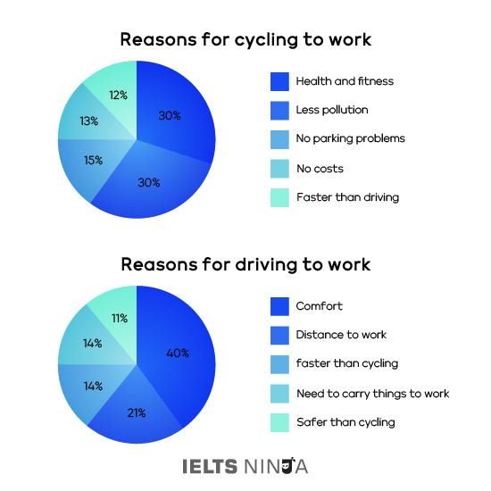
Reasons for cycling or driving to work in the UK.
The above given two pie charts illustrate the intentions of the population behind choosing cycling or driving to work. First, let’s discuss the objectives of the people who choose cycling to work.
The higher proportion of choosing a cycle is health and fitness. People prefer cycling as it’s a good habit to maintain a healthy and fit life. The same percentage of intention contributes to less pollution. Cycling causes less pollution and hence people prefer it extensively.
The next highest percentage, 15% of people, state that they like it because there are no parking issues. 13% of the population says that it is the cheapest means of transport. The least percentage of choosing a cycle to work, 12% states that it is faster than driving.
Moving on to the reasons for people choosing driving to work. The greatest percentage of people’s intention is comfort which contributes 40% in making people prefer driving a car to work. 21% of the people choose driving as they state that their work is too far away from their places to cycle.
While the same 14% of people say that it is faster than driving and they have to carry many things which cannot be carried by cycle. The least percentage, 11% of people, state that it is safer than cycling.
In general, we can conclude that most people choose cycling to maintain a healthy and fit life. While most people prefer driving for their comfort zone.
Pie Chart Sample 4

IELTS Writing Task 1 Pie Chart Model Answer
Ways of delivering the news in Canada and Australia
The above two pie charts depict the ways of delivering news in the two countries, Canada and Australia. As we notice the two countries show extensively similar patterns, though there are some variations.
The greatest and primary source of delivering news in Canada is online which covers one-third, 36% of the total percentage of discovering news. In Australia, more than half of the percentage, 52%, contributes to the online delivery of news to people. The second-highest percentage of sources delivering news is through watching tv being 40% in Canada and 37% in Australia. 14% of the news in Canada is delivered through prints and newspapers. While in Australia, it is only 7% through prints and newspapers. Radio contributes to news, 7% in Canada and only 2% in Australia.
Overall, it can be said that the largest source of discovering news is due to internet use in Australia and Canada as well. And the least percentage of sources in both countries is through radio.
Also Read: How to Write a Map in IELTS Writing Task 1? A Complete Guide For You
IELTS Writing Task 1 Pie Chart 5

IELTS Writing Task 1 Pie Chart Model Answer
The gadgets people use to watch television in Canada.
The above two pie charts show the variation in gadgets used by people for watching television in 10 years from 2009 to 2019 in Canada. It is observed that the highest percentage of the gadgets used for watching television in 2009 is conventional television which is 34% while being extensively declined to 4% in 2019.
The second-highest percentage, 20% of devices used for watching television in 2009 laptops. While in 2019 it brought down to 12%. The next highest proportion of gadgets is the desktop computer, 18% in 2009 and 12% in 2019. Mobile phones contributed 15% in 2009 and increased to 26% in 2019.
Watching television through flat screen tv was 18% in 2009 and decreased to 12% in 2019. The least per cent, 5% of devices in 2009 for watching television is through tablets. While in 2019 it increased to 19%.
Overall, it can be said that the given two pie charts demonstrate that television in Canada over the duration saw a move away from ancient equipment and towards more modern inventions.
IELTS Writing Task 1 Pie Chart Pie Chart 6
Model Answer
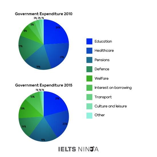
Government expenditure in 2010 and 2015
The above pie charts depict the government expenditure across nine sectors in 2010 and 2015. The variation in expenses over the five years.
As we can observe, in both years, the government expenditure was the highest in the sectors of healthcare, education, defence and pensions, with education taking the highest proportion, 24% in 2010 and 21% in 2015, healthcare taking 22% in 2010 and 20% in 2015, defence taking 17% in 2010 and 14% in 2015 and pensions equal 19 in both the years.
The small regions of expense were cultures, interests in borrowing, transport and leisure and “other expenses”. While the other expenses took 1% in 2010, while transport, culture and leisure and other expenses covered the minimum in 2015 that was 1% each. The interest on borrowing covered 5% in 2010 and 10% in 2015.
Altogether, the charts demonstrate that the government has had to cut expenses in most regions to finance the price of borrowing and welfare.
IELTS Writing Task 1 Pie Chart Pie Chart 7

Model Answer for IELTS Writing Task 1 Pie Chart
Merits and Demerits of Bowen Island
The above pie chart demonstrates the disadvantages and advantages of Bowen Island, which tourists enjoy most and the least while visiting. Let’s first look at the disadvantages of Bowen island. The greatest demerit of Bowen island is that it has a very high cost of living which contributes to 50% of the demerits.
The next disadvantage is the lack of entertainment on the island which contributes 25% of the demerits. 15% of the total disadvantage proportion participates in weather. The weather is not suitable for people visiting the island. Food contributes to the least percentage of disadvantage 10%.
Moving to the advantages of Bowen island. The greatest proportion of advantage of the island is the people, 42%. The population on the island is high making the people prefer visiting it. The next highest percentage of merit is 35% which covers the scenery of the place. 12% contributes to culture as an advantage of the place. And the least merit of the place is the good accommodation.
All around, it appears that most populations like Bowen Island because of the view and people. And the reason for people not visiting the place is due to expensive living.
Preparation Tips For IELTS Writing Task 1
# Don’t consume more than 20 minutes in this segment. It usually takes less than 20 minutes to write a brief report of 150 words.
# Always try to exceed the word count by 20-30 words. It is mentioned in the question to write a 150-word summary. Aspirant is suggested to exceed it to 170-180 words.
# Analyse the visual information carefully to make sure you don’t miss any data while transferring the information.
# Never cut off any data provided in the pie chart. Mention all details illustrated.
# Don’t add unnecessary information just to increase the word limit. Stick to the data provided.
Some More Tips
# Maintain paraphrasing in the context. Try to change the phrases and write in your own words. Make use of good synonyms which do not change the actual meaning of the sentence.
# During writing the summary of the information, divide the report into three paragraphs: introduction, body and conclusion.
# Pie charts that compare certain information need to be carefully analysed and paraphrased with all the variations illustrated.
Also, Read IELTS Writing Task 1 Academic Sample Questions: Here’s Your Way to Boost-up Your IELTS Preparation
Conclusion
Expecting that the above article helped you know everything related to pie charts of writing task 1 of the IELTS examination. The pattern and the manner how the descriptive report should be written is clearly illustrated above. Analyse the given samples of pie charts.
For aspirants who are desiring to move abroad to seek their higher education, they need to obtain a reasonable band score in the IELTS assessment which is above the minimum expected mark by their institute and the nation where they want to shift.
To get a favourable band score, ensure that you review each category individually and become well versed with the tactics to be utilised for each category to finish the assessment in the specified time and with incredible precision.
For more content related to IELTS and all English foreign tests, visit the website IELTS Ninja for great content and the best guidance for the aspirants for their promising future.